








There is a particular kind of shopping tab that never gets closed. A jacket someone likes. A gift they almost bought. A collection they meant to explore after dinner. Nothing is wrong with the product. There is simply no reason to decide now, and a hundred other things asking for attention.
A useful deadline changes the question. “Do I want this?” becomes “Do I want this before the offer ends, the preorder closes, or the last dispatch leaves?” The product still has to deserve the purchase. But the decision now belongs to a moment.
That is where countdown timers for Shopify can earn their place. A timer takes a date buried in campaign copy and makes it visible. It can turn a launch into something to look forward to, a promotion into a distinct event, or a shipping promise into a practical reason to finish an order. It gives a shopper a way to see what waiting changes.
The clock is only one part of that experience. A huge timer announcing a tiny saving can feel absurd. A discreet line beside shipping information can be enormously useful. A bright strip across a fashion store can make Black Friday feel alive, while the same strip above a thoughtful product launch might cheapen it. The offer, the timing and the design need to tell the same story.
The most interesting countdown campaigns begin with a situation worth caring about. What is the shopper trying to do? What will change if they wait? How can the store make acting now feel worthwhile? The examples here use real presets from GSC Countdown Timer Bar, our Shopify countdown timer app, with six formats ranging from a tiny line of time to a full campaign section. We’re GSC, the team behind the app and part of Getsitecontrol.
Why countdown timers work: a deadline gives the offer a shape
An offer without a boundary can become part of the furniture. If a store is always “on sale,” shoppers have little reason to treat today differently from next Thursday. A specific closing time gives a promotion a beginning, a middle and an end. It makes the offer easier to understand and the campaign easier to evaluate.
There are several reasons that can matter. A shopper may want to avoid missing a saving they already value. They may be excited to be among the first to see a release. They may need a gift to arrive before a birthday. Or they may simply appreciate knowing that they still have time to make the afternoon dispatch.
These are different motivations. Scarcity concerns a limited opportunity: fewer units, fewer places or restricted access. Urgency concerns the time available to act. Anticipation concerns what is about to become possible. A countdown can make the time visible in all three situations, but the clock does not turn an unlimited product into a scarce one.
Fear of missing out is one possible response; anticipation, convenience and relief are others. A good countdown does not have to sound anxious. “Your weekend starts here” can be more persuasive than “Last chance,” provided the message makes clear what happens and when.
The useful discipline is to finish this sentence before choosing a preset: When the timer reaches zero, something meaningful changes. The discount ends. Ordering closes. The collection goes live. Today’s pickup window is over. If the answer is only “the clock starts again,” the campaign needs a better idea.
Barton, Zlatevska and Oppewal’s 2022 meta-analysis in the Journal of Retailing points to a more varied picture than a universal sales trick: results depend on the kind of scarcity, the product and the context. Purchase intention is also different from a completed order. The opportunity is to understand your particular shopper, not assume that one psychological trigger will work on everyone.
A deadline also needs enough room for the purchase decision. A familiar replenishment product can support a short flash offer. An expensive sofa may need time for measurements, fabric samples and a conversation at home. Countdowns work best when they respect the kind of decision the customer is actually making.
Give shoppers something worth looking forward to


The price of “I’ll come back later”
An open-ended decision has a comfortable escape hatch: later. Later costs nothing in the shopper’s imagination. They can keep the possibility of owning the jacket without choosing a size, spending the money or committing to a delivery date. A deadline gives waiting a consequence. Tomorrow may mean the ordinary price, a missed gift or a later dispatch.
That is the persuasive territory often described through loss aversion and anticipated regret. The shopper can imagine losing an opportunity they already like. “I could have had the matching pouch” is more concrete than a generic message about urgency. This is a way to understand the appeal, not a promise that every visitor will respond in the same way. Pressure can also produce irritation, especially when the purchase deserves consideration.
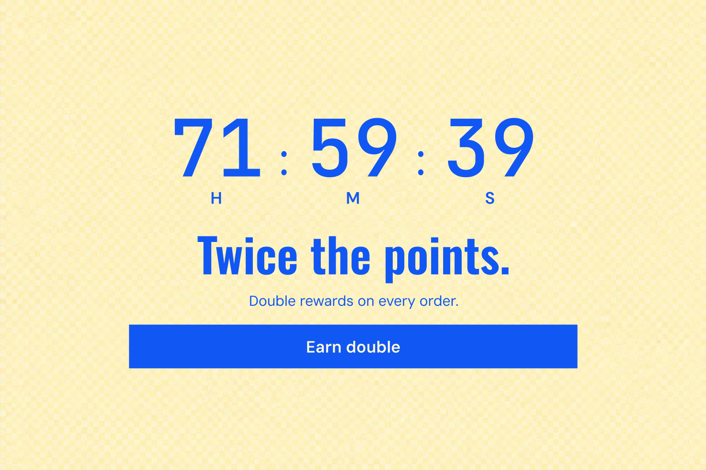
The strongest creative starts with the desired outcome. Picture the dress arriving before the party, the complete coffee setup on the kitchen counter, the first chance to wear a new colour. Then show the boundary around that outcome. The timer makes a wanted possibility feel immediate. Without the desire, you have only moving numbers.
Scarcity has more than one flavour
A hundred numbered prints are scarce because there are only a hundred. A member preview is scarce because access is restricted. A made-to-order collection has a limited ordering window because production begins after it closes. These are different stories, and their designs should feel different too.
A timer is particularly good at the last part: making the window visible. It can sit beside genuine limited-stock information, but it should never stand in for it. “Order before Sunday” is a time promise. “Only three left” is an inventory claim. When both are true, the combination gives customers a clear picture of the opportunity.
Exclusivity can also feel generous. Early access says, “You get to see this first.” A timed upgrade says, “There is something extra for you today.” The emotional range is much richer than panic. A store can use a deadline to create belonging, reward attention or make a practical service feel exceptionally well timed.
Anticipation is urgency looking forward
A launch countdown makes the future part of the storefront. People can imagine the opening, plan a visit and share the date. For a brand with a following, the waiting can become part of the pleasure: a teaser today, a closer look tomorrow, the full collection on Friday.
That is a different creative brief from clearing old stock. A launch asks people to lean in. A sale close asks them to finish deciding. A delivery cutoff helps them avoid an inconvenience. Choose the feeling before choosing the colour of the digits, and a surprising number of design decisions become easier.
Flash-sale countdown timers: make an ordinary afternoon an event
It is mid-afternoon. Someone opens a store after seeing a message about a two-hour offer on the bags they have been considering. They are interested, but the homepage contains every collection, a long brand story and a vague “Sale” link. The campaign has brought them to the door and then left them there.
A flash sale needs a much shorter path. The offer should be apparent immediately, the eligible products easy to find, and the remaining time connected to a single action. “The carry-on edit: 20% off until 6 pm” says more than a huge clock beside “Hurry.” It tells the shopper what is happening, what is included and why this visit is different.
Make the offer impossible to miss


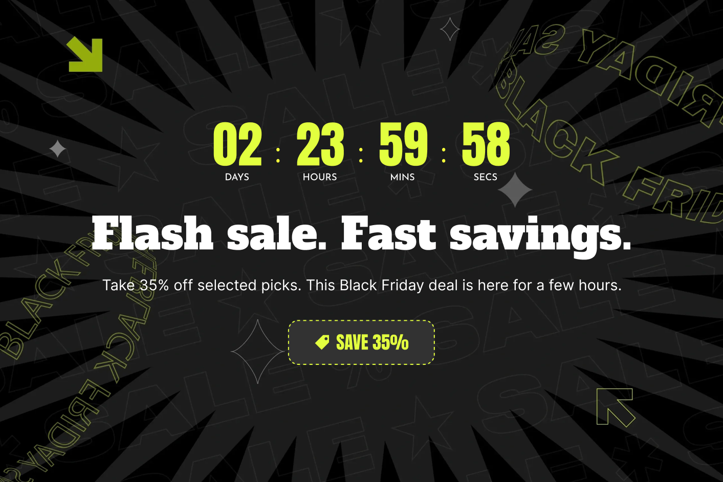
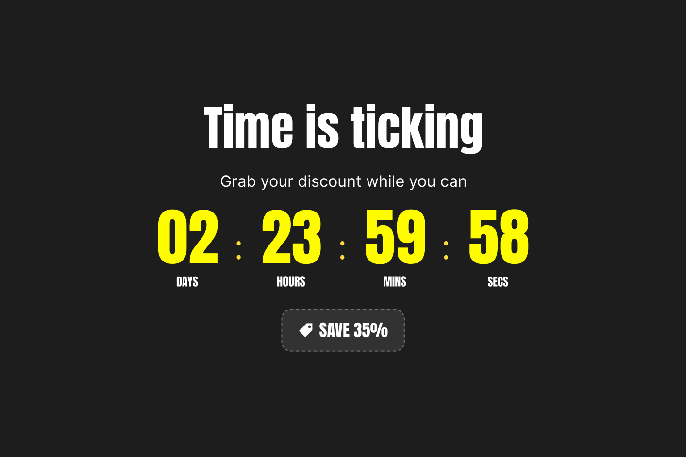
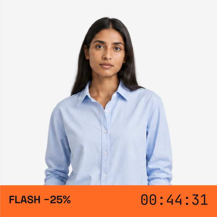
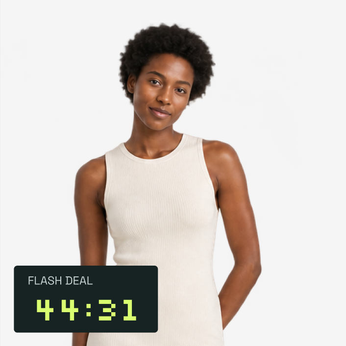
A Bar is a natural fit for that first encounter. It can sit at the top or bottom of the storefront and stay visible as people browse. A vivid orange, electric blue or high-contrast black-and-yellow preset gives the event its own visual identity. The button should lead straight to the edit. If there is a code, the coupon component can keep it within reach.
The economic case is focus. You are concentrating attention on a specific assortment over a short period, perhaps to support a seasonal change or introduce a category to an existing audience. The discount is the cost of that attention. Keep the collection narrow enough that the shopper can make a choice without spending the entire window searching.
A fixed closing time is the appropriate clock: everyone is participating in the same event. An hours–minutes–seconds display makes the scale clear and gives a short event a visible pace. Before announcing “two hours only,” make sure the offer is useful enough to justify those two hours of urgency.
Black Friday needs a world of its own
Black Friday shoppers arrive expecting deals. That makes a discount easy to understand and easy to ignore. Your store is competing with a crowded inbox, several open tabs and the suspicion that another offer may be better. The task is to make your particular event clear and easy to shop.
Start with a campaign people can describe. “The winter wardrobe event” feels different from a warehouse clearance. “Our biggest bundle of the year” gives a subscription or replenishment brand a specific proposition. “Selected gifts, special prices until Monday” helps someone who is shopping for other people rather than themselves.
Give the sale its own visual world
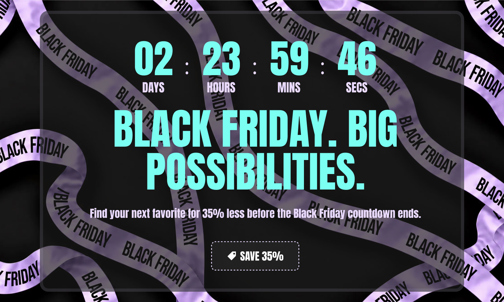

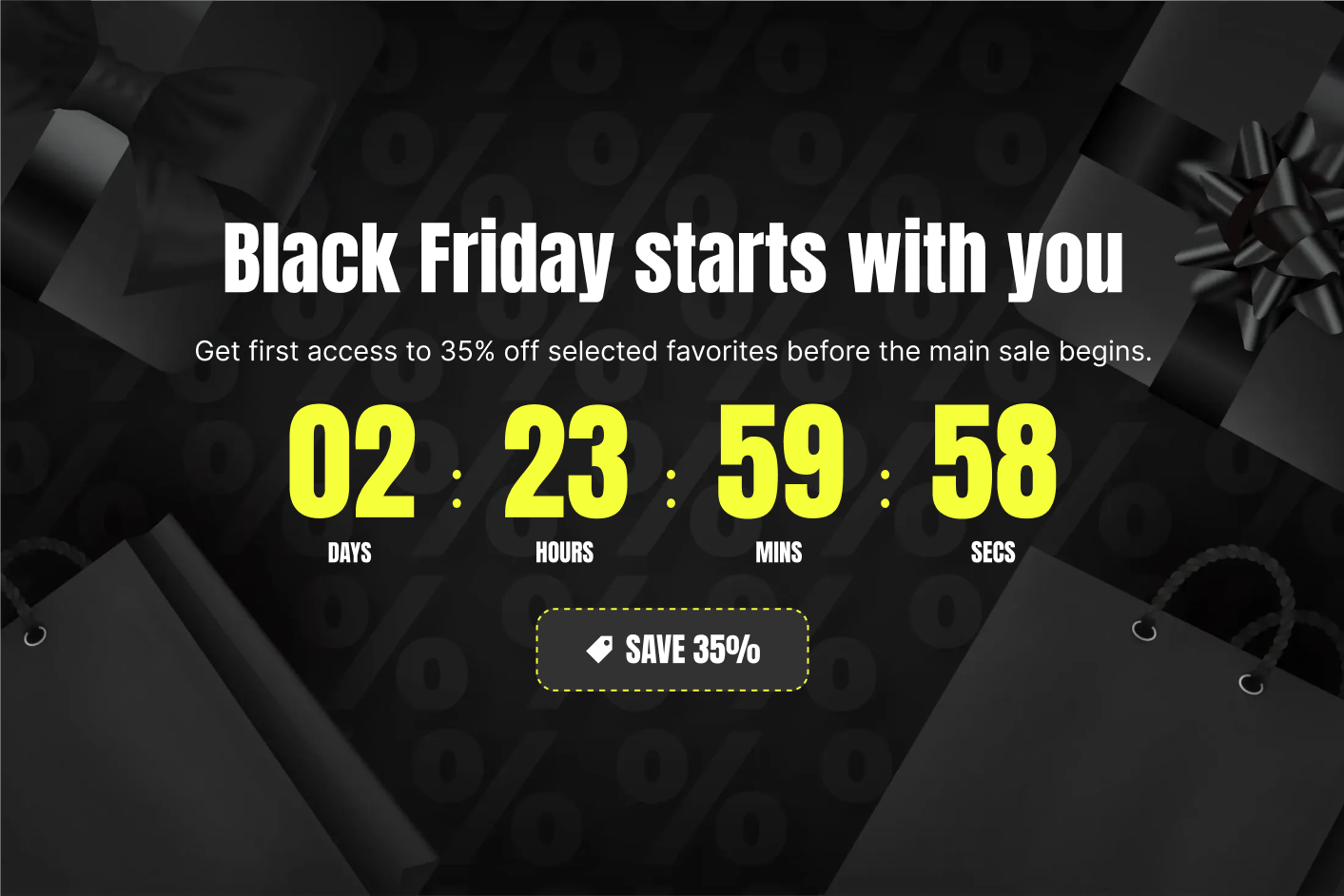
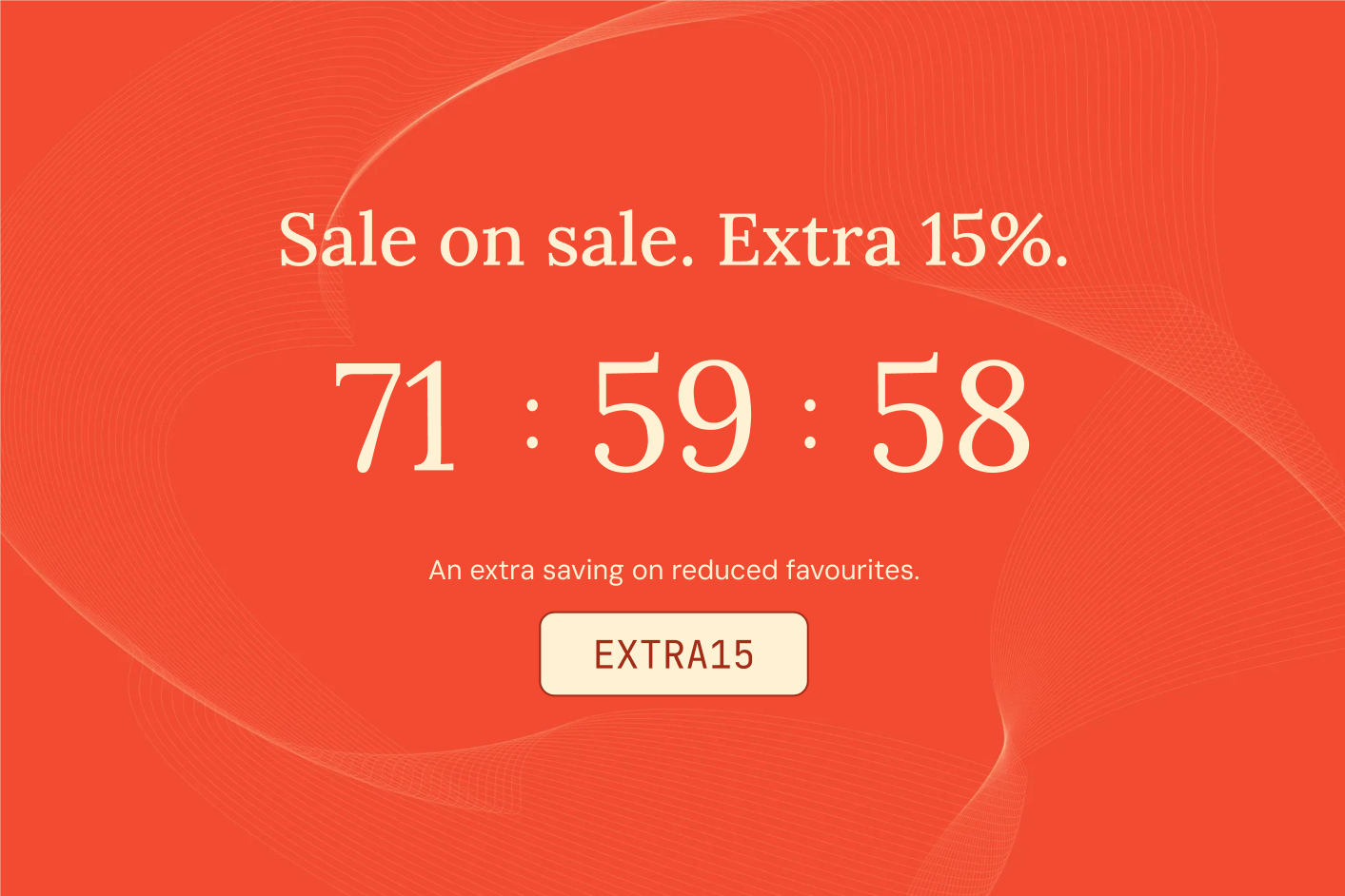
A Large countdown can give that proposition a proper entrance on the homepage. Product imagery establishes the world of the campaign; the headline explains the value; the timer makes the closing date tangible. A smaller Bar can then carry the reminder through the rest of the journey.
The designs can share colours and typography without being identical. The homepage has room for a generous composition. The persistent bar needs to be economical. Product labels can identify the participating items. Together they make a campaign feel coherent rather than like three unrelated promotions installed on the same store.
There is a useful distinction between excitement and information. The hero can be expressive. The details should be exact: selected products or everything, code or automatic discount, closing time and timezone. “Up to 50%” should lead to a collection where the range of savings is understandable.
Plan the final evening as part of the same event. “Black Friday ends tonight” can replace the opening announcement without changing the deadline. The emotional note becomes closure, not another launch. When the event finishes, let the storefront move on. A campaign that actually ends gives the next one more credibility.
Carry the event into the product journey


The pleasure of waiting for something new
A launch has a different kind of energy. There is nothing to lose yet because the product is not available. The attraction is discovery: seeing the new colour, getting the first look, finding out whether the collection is as good as the photographs suggest.
A countdown can give that anticipation a destination. “The coastal collection arrives Friday” creates a shared moment. It invites a return visit without immediately asking for a purchase. The timer turns “coming soon” from an indefinite promise into an appointment.
Make the wait part of the pleasure

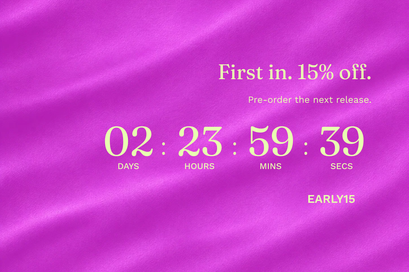
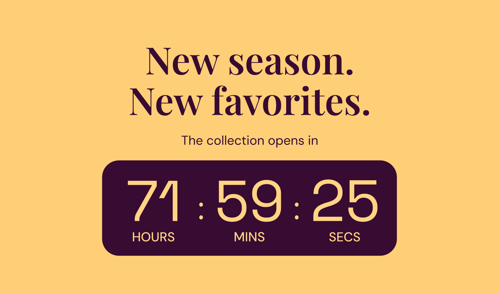
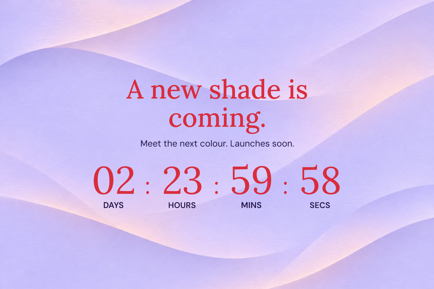
This is where the Large format can look especially strong. Let the product set the mood: a close detail of the fabric, a striking campaign image, an unusual colour combination. The digits can be beautiful without shouting. A restrained editorial design may make a premium release feel more desirable than a conventional sale treatment.
Give people a reason to care before asking them to come back. A line about what is new, a glimpse of the assortment or a link to the collection story makes the wait more concrete. If you want signups, send the button to a page or form that handles them; the timer itself is the invitation, not the subscriber system.
A fixed-date clock keeps everyone looking toward the same release time. Days and hours suit the buildup. A compact bar can carry a final reminder on launch morning while the larger section does the visual storytelling.
The commercial opportunity is to gather attention around a moment instead of letting a new collection quietly appear in the catalogue. That attention becomes useful only if the next step is ready. At zero, the collection, stock, navigation and campaign links should all lead somewhere people can actually shop.
A drop with a reason to be limited
A limited drop is not simply a launch with more exclamation marks. It has a reason for its scale: a small production run, a collaboration, a seasonal colour or a release that will not remain in the permanent range. That reason is part of the appeal.
Tell the story of the constraint. “A small run, made for summer” is more interesting than a mysterious warning that stock is disappearing. Explain what makes the release distinct, then use the countdown to communicate the relevant time: when it opens, or when a defined ordering window closes.
A release worth returning for
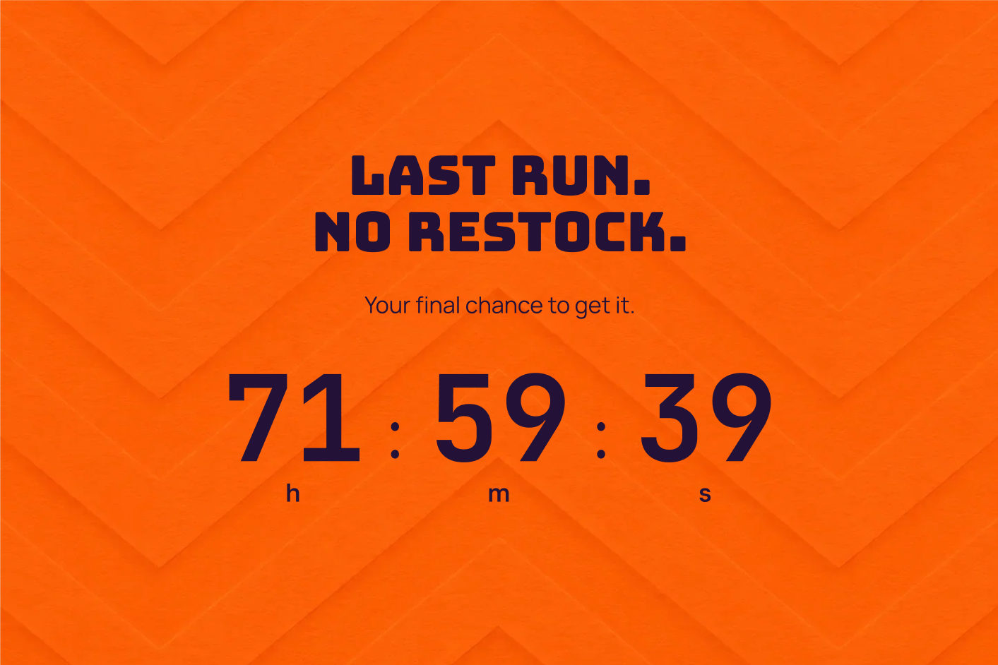


The difference matters. A timer counts time, not units. If the release can sell out before the closing date, say so in the campaign copy. Do not let the digits imply that every size will remain available until zero. Product availability and the release deadline answer different questions.
A Product label can make the limited collection recognisable within a larger catalogue. A Small block on the product page can carry the fuller story close to size selection. On an image-led brand, a carefully positioned label is often more effective than another banner above the photography.
The economics can be attractive without a discount. A concentrated release can help a small assortment receive more attention, and a clear ordering window can make the buying moment easier to understand. But the product’s character has to carry the desire. The clock cannot manufacture a reason to want a collaboration that otherwise feels ordinary.
Try copy that sounds like the brand: “The final weekend for this colour” or “The studio edition opens at noon.” Specificity creates more atmosphere than generic pressure.
The reassuring certainty of a preorder window
Preorders ask for trust. The customer is committing now to something that arrives later, so they need a clear understanding of the product, the timing and the terms. A countdown can help by giving the ordering period a definite end.
Imagine a small ceramics studio opening orders for its next firing. “Orders close Sunday” is useful information. It tells someone who has been thinking about a set when they need to decide, and it gives the studio a clear campaign window to communicate.
A window to get in early
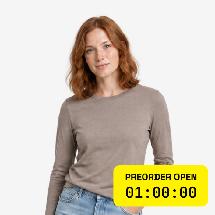

Place a Small countdown near the preorder explanation. There is room for the closing message and a short supporting line, while the product imagery and purchase controls remain central. A more compact Inline timer can work when the page already has a well-designed preorder information area.
Keep the expected dispatch date separate and easy to see. “Preorders close in two days” does not answer when the customer receives the product. The most reassuring arrangement explains both: the ordering deadline beside the timer, the estimated fulfilment period beside the purchase details.
A preorder close can support production planning, but the timer does not close the product by itself. Prepare the product availability or preorder process for the same end time. The promise is strongest when the storefront behaves exactly as the campaign said it would.
This is a case where calm can outperform theatrical design. A warm background, generous type and a clear fixed deadline can make the purchase feel organised. The shopper should leave with confidence that they understand the arrangement, not merely relief that they clicked before a flashing clock expired.
The gift has to arrive in time
A gift shopper is buying a product and an outcome. The scarf has to be right, but it also has to arrive before someone opens the door on Christmas morning. Near a holiday, delivery information can be more persuasive than another small discount.
A countdown to the last order date makes the decision practical. “Order by Thursday for our Christmas dispatch schedule” gives shoppers a reason to stop postponing. Where you can make a more specific delivery promise, state its applicable destination and shipping method clearly.
Sell the feeling of being ready


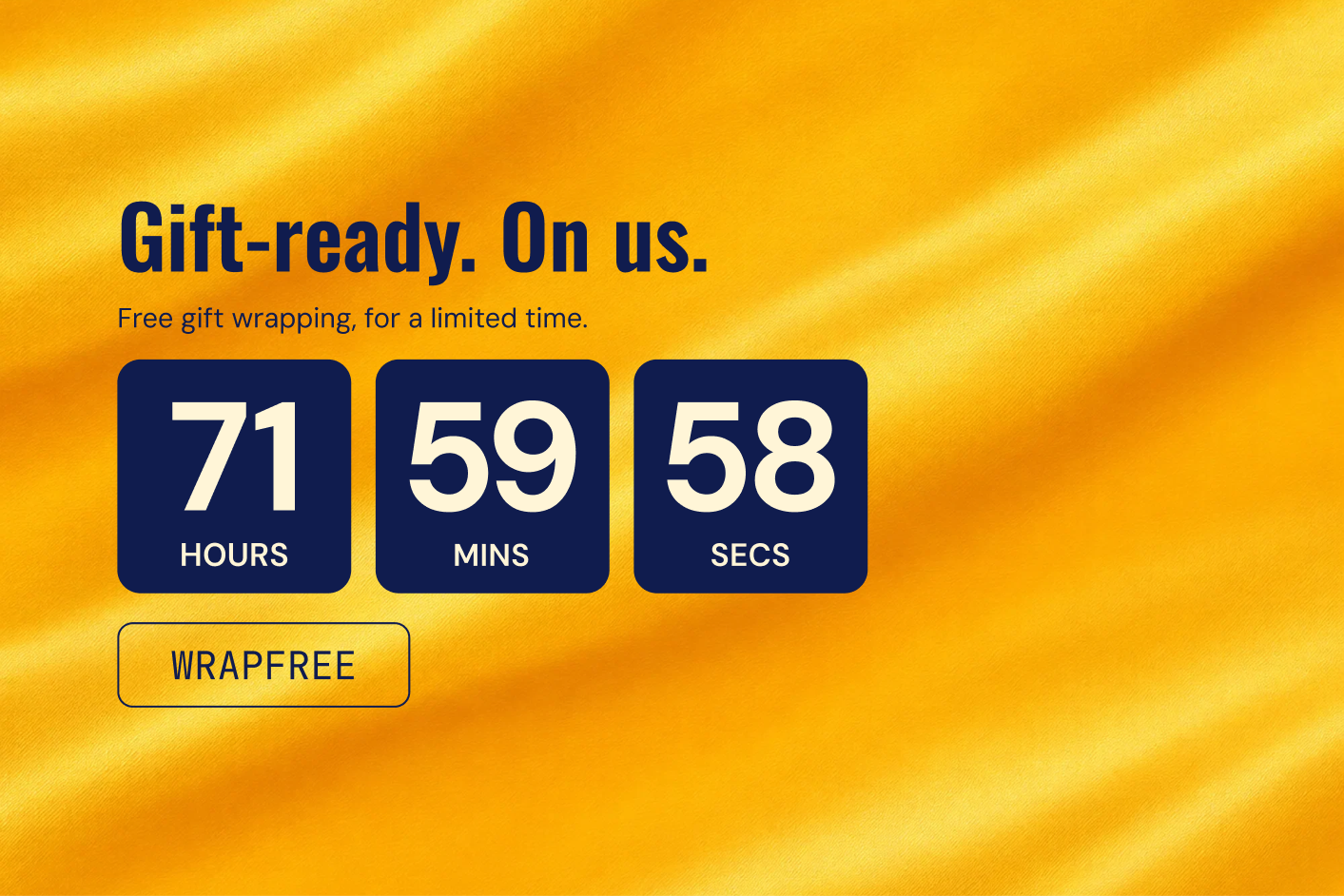
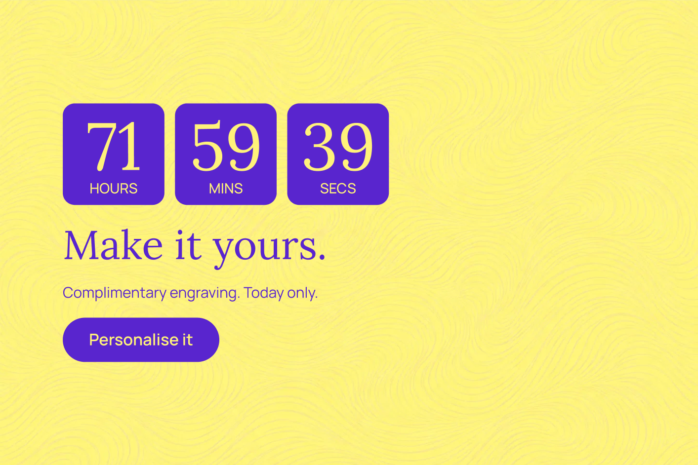
A storewide Bar works when the deadline is broadly relevant. A product-page Inline timer is better when availability or fulfilment differs across the assortment. Keep the message close to the information people need to trust it, such as the eligible service or a link to shipping details.
The design can carry the season without turning into visual noise. A rich red or green preset may suit festive gifting; a soft neutral treatment can preserve a more understated brand. The important contrast is between the deadline and its background, not between the widget and everything else on the page.
After the shipping deadline, change the proposition. Local pickup, a digital gift card or a later-delivery promise may still be useful, but they are different offers. Do not leave a clock at zero above a message that no longer applies.
This case demonstrates why urgency need not feel aggressive. The deadline exists outside the marketing department. Showing it well helps the customer avoid disappointment and helps the store receive orders while it can still fulfil the promise.
Two hours can change the day
Not every useful deadline happens once a year. A bakery, florist or local retailer may have an order cutoff every working day. An online store may dispatch orders placed before 2 pm. These are recurring opportunities to make timing part of the service.
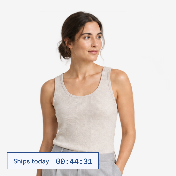
A Daily timer can run during selected hours on selected weekdays, using the store’s timezone. “Order within [timer] for dispatch today” explains why buying now matters. For pickup, the message might be “Place your order before 4 pm for collection today.”
Today is a useful reason to decide
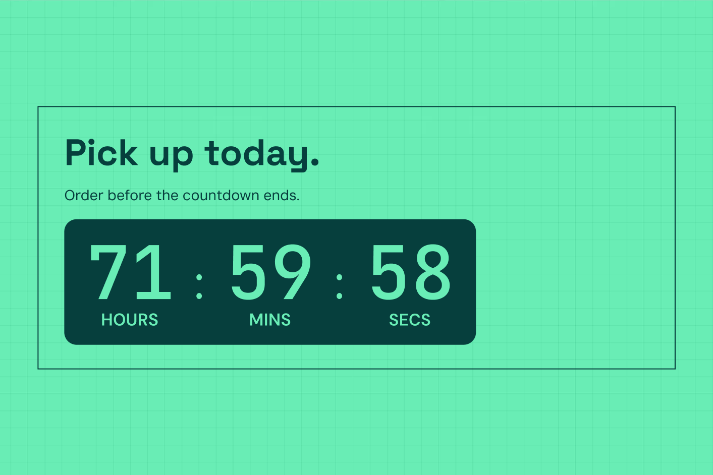

The compact Inline format is especially good here. It can sit alongside delivery information and feel like part of the product page. The message is useful enough that it does not need to impersonate a major sale. A small icon, readable digits and a restrained accent can be all the design required.
There is also room for an expressive treatment when it fits the business. A colourful lunchtime collection window for a food store can feel lively and welcoming. The same clock in a specialist equipment store may work better as a straightforward operational detail.
The benefit is clarity at the point of decision. Customers can see whether acting now changes the outcome, and your team can communicate a predictable timetable. Keep the active hours and weekdays aligned with the real operation, including holiday exceptions. Daily mode is suited to a window within the day, with the end after the start.
Outside the window, the timer can disappear rather than continue presenting an expired promise. That makes the information feel dependable: visible when it helps, absent when the opportunity has passed.
Countdown timers on product pages and cards
Sometimes the product that needs attention is already in the catalogue. A seasonal edit, a discontinued colour or a short promotion on a specific range can benefit from a deadline without turning the entire store into a sale.
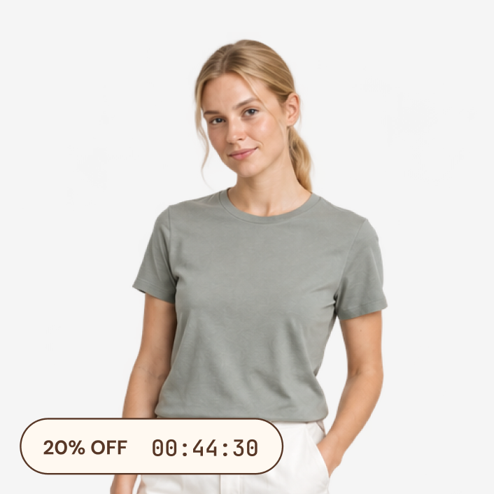
The challenge is relevance. Someone browsing full-price new arrivals should not have to decode whether a banner about “20% off” includes the item in front of them. A Product label can attach the campaign to the eligible products themselves.
Put the deadline on the right item


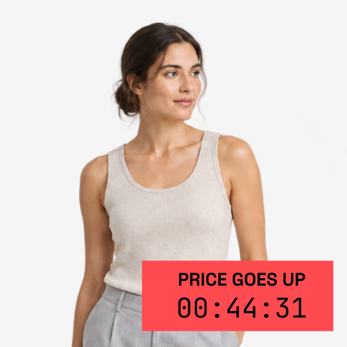
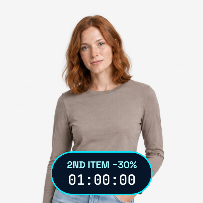
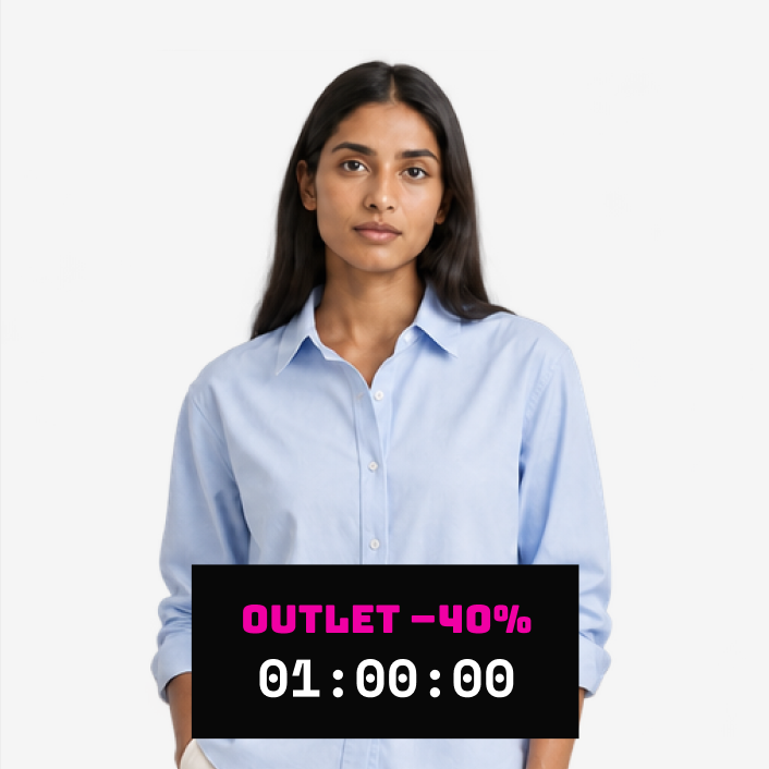
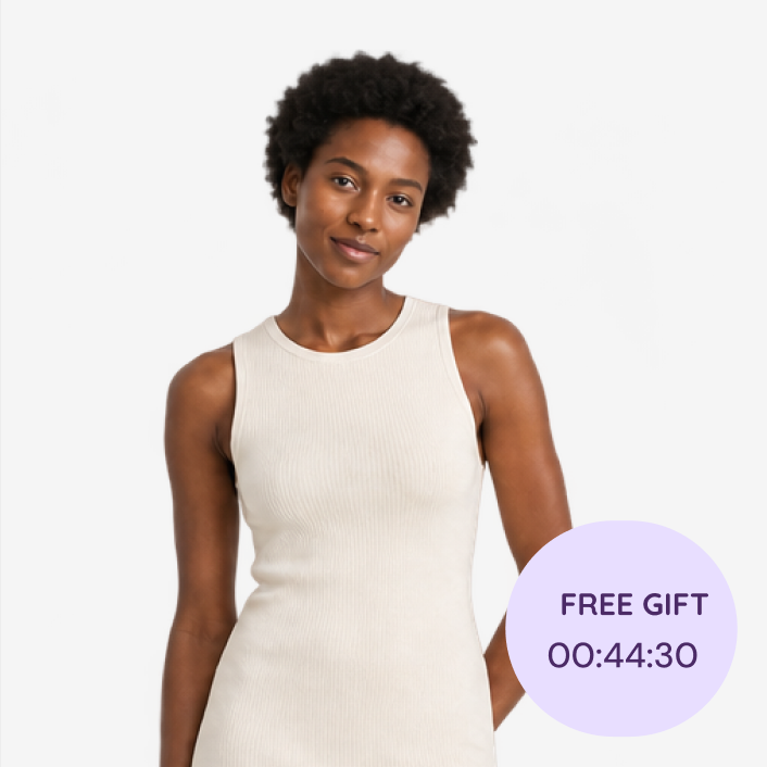
This is particularly useful in collection grids. A small countdown on the image identifies the promoted items before the shopper opens a product page. The label can use the campaign’s colours, while the rest of the card continues to show the product normally.
Choose a position that respects the photograph. A corner badge can work around a centred subject; a narrow strip may suit a product with space at the bottom. The app’s offsets, layout and rotation controls give the preset room to fit the image rather than cover its most important detail.
Product rules can help maintain the selection. A campaign tag or collection is often easy for a merchant to understand and update. More specific conditions can narrow the display where appropriate. Check both matching and non-matching items, especially if several campaigns share the same catalogue.
Commercially, this is a way to focus attention and discount cost on the assortment that needs it. The rest of the store can retain its normal positioning. The timer says “this opportunity has a window,” while the product and price explain whether it is worth taking.
The last weekend of a season
Clearance is often presented as a wall of products and a large percentage. That can be exciting, but it can also create work: searching for available sizes, comparing reductions and wondering whether the selection will still be there later.
A deadline gives the event a boundary, while good merchandising gives it a usable shape. “The final weekend of summer prices” is a stronger starting point than an unexplained clock. Organise the destination around the choices customers need to make, such as size, category or intended use.
Give the final weekend a proper send-off
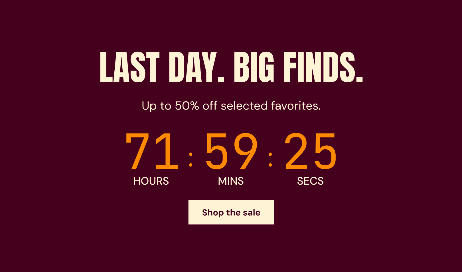

An Inline bar above a homepage clearance section can introduce the closing window without covering the grid. Product labels can identify participating items, and a Small timer can reinforce the offer on the product page. You do not need all three; choose the places where customers might otherwise lose the context.
The economic logic is specific. You may be making room for a new season or reducing the amount of cash tied up in an old assortment. That makes margin, stock movement and discount depth more meaningful measures than the number of people who clicked the timer.
Time and stock can both be relevant, but keep them distinct. A closing date is a time limit. Limited sizes are an availability constraint. If either could end the opportunity first, say that plainly rather than asking one animated badge to imply everything.
Clearance can still look considered. A strong typographic design, an energetic colour and a direct shopping link can feel more confident than layering several urgency messages on top of each other. The customer should see a good opportunity, not a store losing control of its own promotion.
Different stock, different story
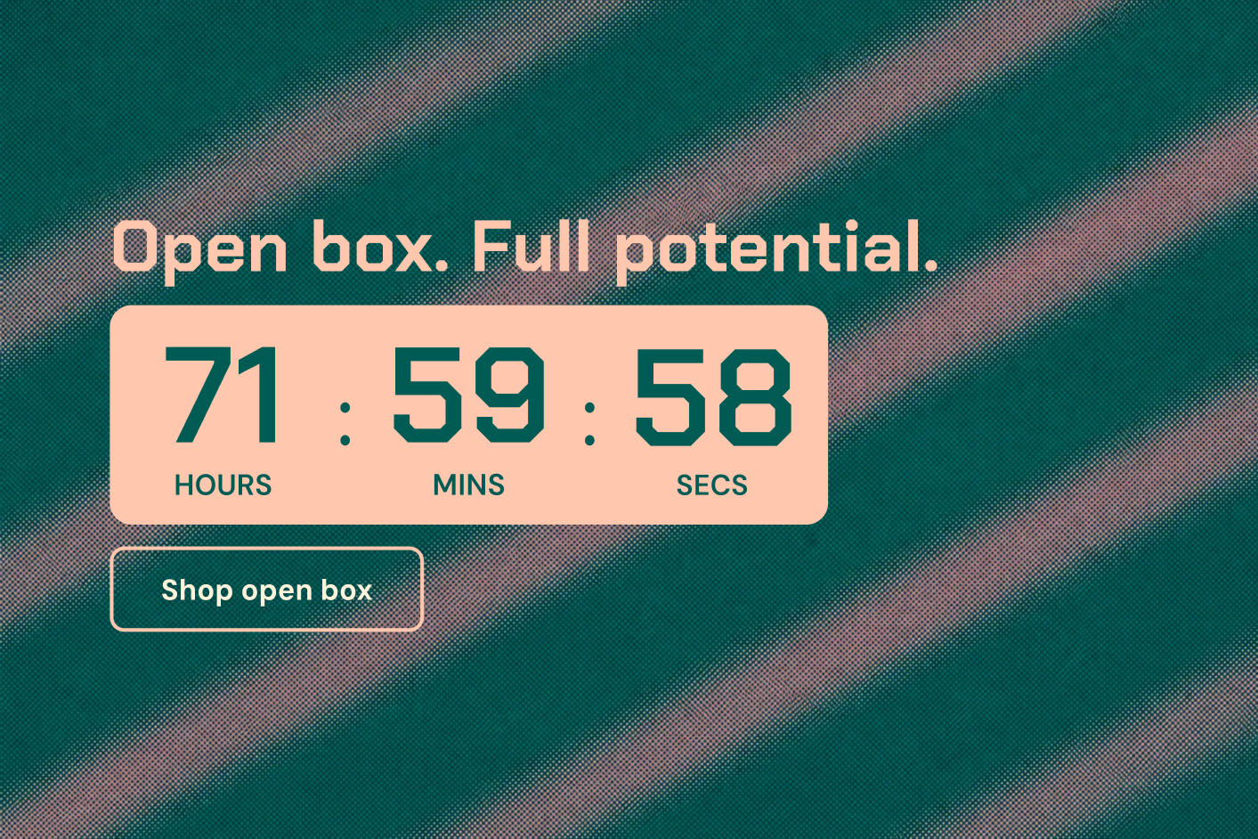

A better choice, not just a lower price
Bundles can make an offer more valuable without reducing every individual price. A complete routine, a coordinated gift set or a useful multipack can help shoppers buy a combination that makes sense together. A countdown can give a seasonal version of that bundle a defined moment.
For example, a skincare store might offer its travel routine for a long weekend campaign. The message is not simply “spend more.” It is “everything you need for the trip, together until Monday.” A Large section can show the set as a complete idea; a Small block can keep the deadline visible beside the bundle’s purchase details.
Make the combination desirable
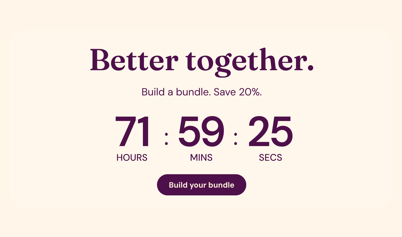

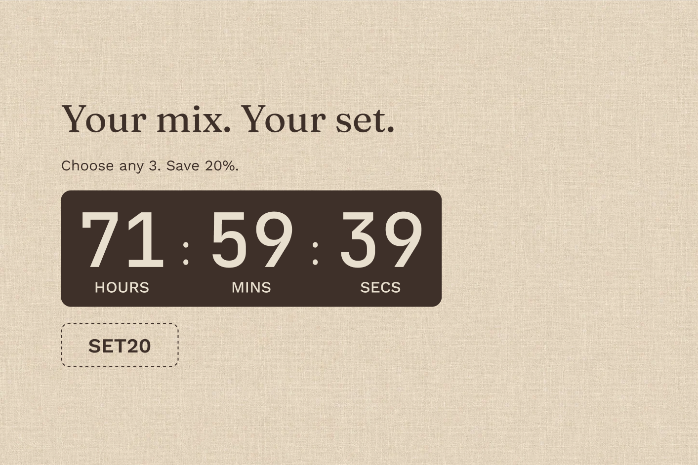
The design should make the combination easy to understand. Use the campaign image to show what is included, then let the clock and action support it. A narrow timer squeezed between a list of unfamiliar products is less useful than a composition that first explains why the set belongs together.
For the business, the question is whether the bundle creates a worthwhile order after its costs. A larger basket is not automatically a better one if the discount or fulfilment burden consumes the gain. Compare the offer with how the same products normally sell, and consider whether it helps introduce an item customers might later buy again.
A fixed deadline suits a seasonal bundle. Link the timer straight to the bundle or collection. When the campaign ends, the clock and the offer should move on together.
The best copy names the occasion: “The weekend kit, available until Sunday” or “Build your winter routine before the offer ends.” It gives the bundle a purpose as well as a price.
Make the extra feel tangible
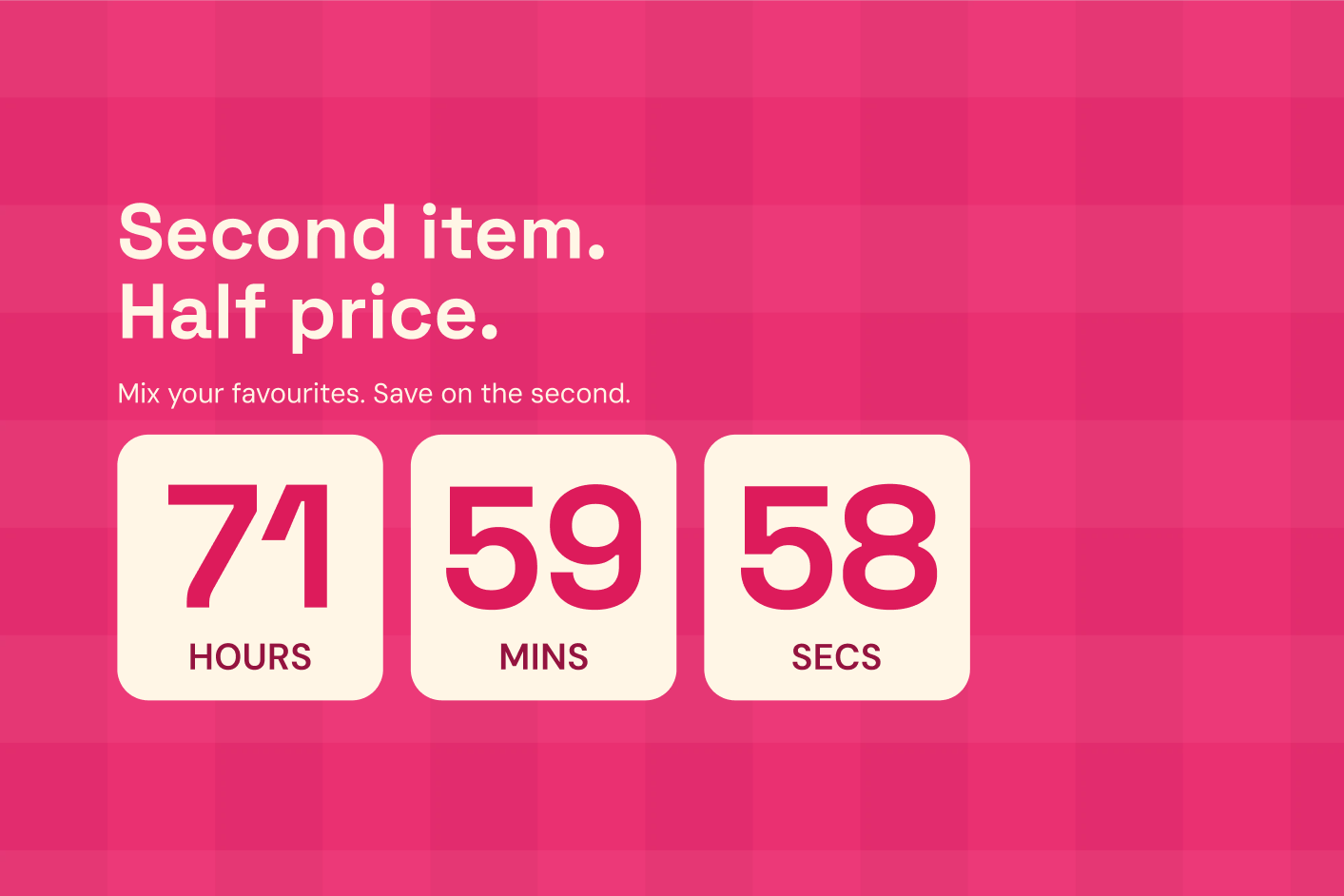
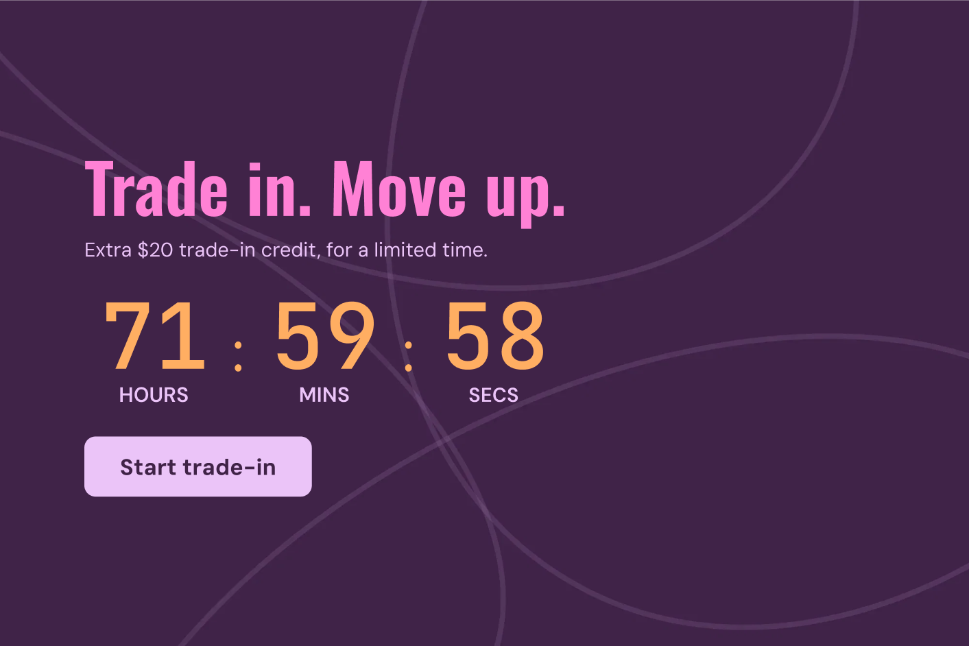
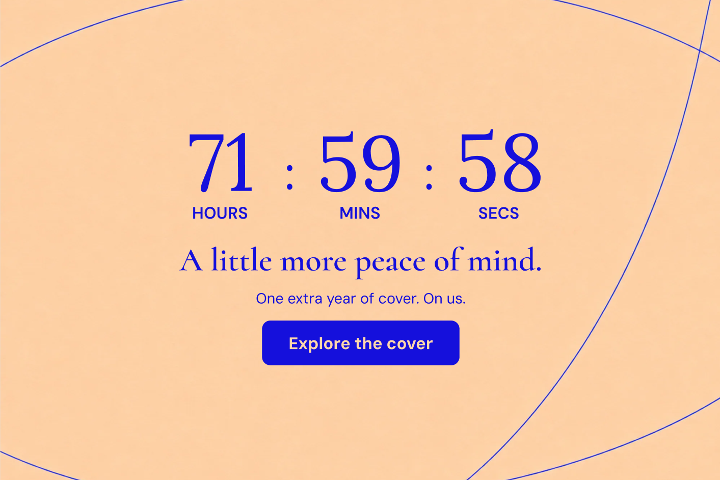
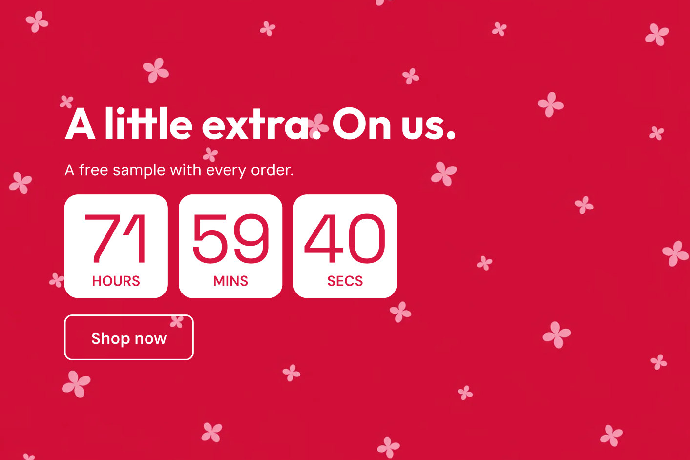
Some of the most interesting presets put the benefit somewhere other than a percentage discount. “Size up. On us.” changes the choice a customer is considering. “Lens upgrade. Half price.” gives a buyer a reason to choose a better version. “2-year cover. On us.” offers reassurance rather than another item in the basket.
Imagine someone buying a camera accessory. A small general discount might help, but a relevant upgrade could make the purchase feel substantially better. The countdown gives that extra a defined window; the product page explains what the upgrade includes and how to select it. Show the better version clearly enough that the buyer can picture using it.
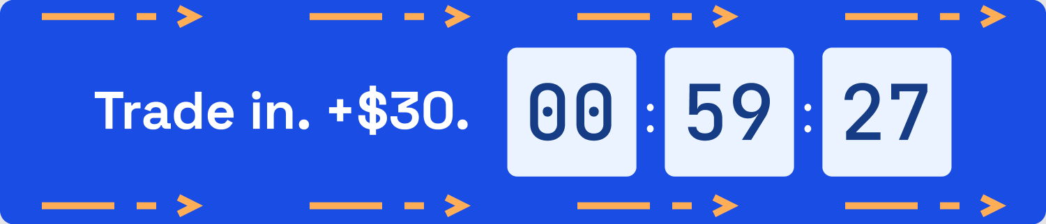
A trade-in offer introduces another kind of value. The preset “Trade in +$30” gives a customer a reason to bring an existing item into the decision. The useful story is about what they can move on to and the temporary extra allowance, with clear eligibility and a link to the trade-in process. The temporary bonus gives an otherwise easy-to-postpone upgrade a reason to happen now.
These are stronger ideas when the extra has a close relationship to the purchase. A meaningful upgrade can protect the core product’s price while changing the value of the order. A random freebie simply adds a cost. Let the campaign answer what becomes better for the customer, then let the clock explain how long that version of the offer lasts.
Make an upgrade worth choosing



The extra that completes the order
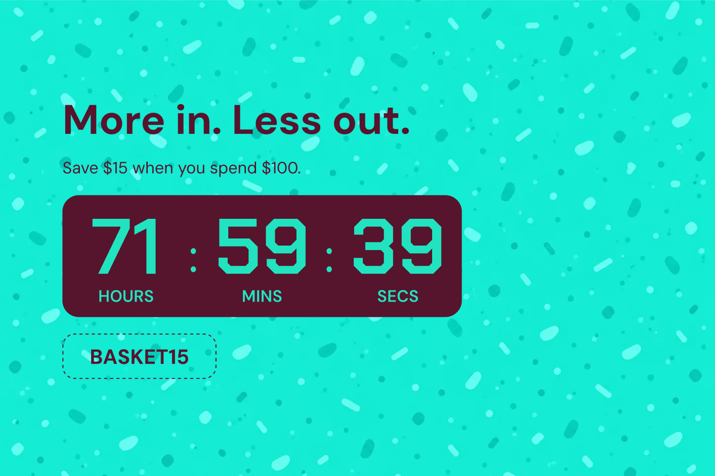
A shopper is close to a qualifying order value. A free gift or shipping offer could make another item worthwhile, but only if the benefit is clear and the additional purchase still makes sense. A countdown can add the campaign window without turning that decision into a puzzle.
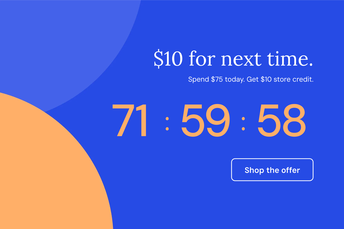
“Complimentary pouch with orders over $100 until Sunday” contains the essential information. The gift, threshold and closing time are all present. A cart-page Inline bar can keep that proposition near the order summary, while a smaller block may fit a compatible cart drawer.
The extra that earns its place
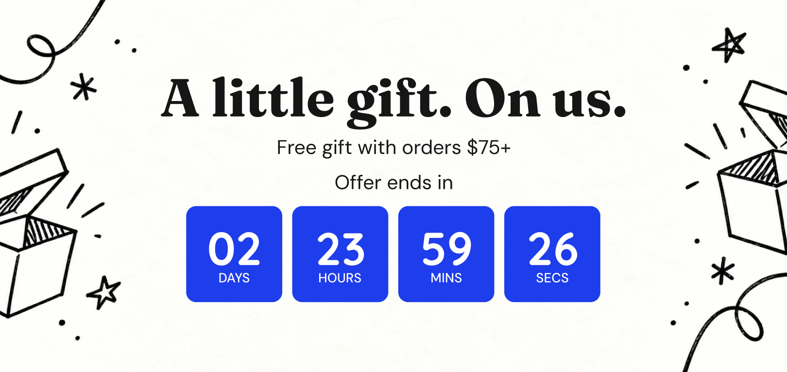
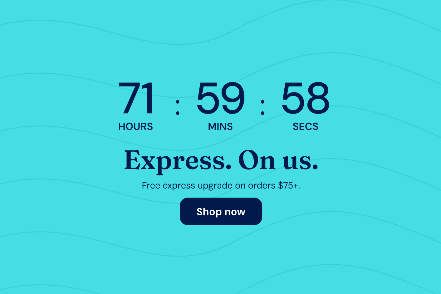
For free shipping, the equivalent message might be “Free shipping over $75 ends tonight.” The threshold should remain visible next to the timer. Do not force shoppers to leave the cart to discover the condition that decides whether the offer applies.
There is a delicate commercial balance here. The gift or shipping cost is the incentive; any extra contribution from the order must justify it. Choose a reward that feels relevant to the products, and make the route to useful additional items simple. A link to complementary accessories can help more than a generic “Shop more” instruction.
The countdown communicates the deadline. Gift eligibility, gift fulfilment and shipping rules belong to the store’s offer setup. If you want a changing “you’re $12 away” message, that requires cart-aware logic beyond a static timer message.
Keep the presentation compact at this stage. The shopper has already assembled an order. A clear benefit and a credible deadline can help them finish; a large promotional block that pushes checkout out of view can create another obstacle.
Keep the benefit close to the order




A welcome with a window
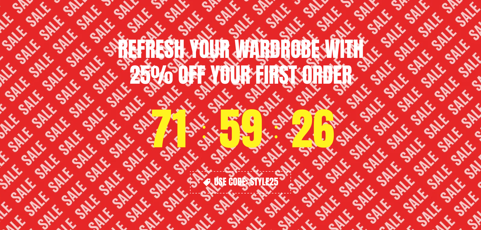
A visitor may need a little encouragement to try an unfamiliar brand. The risk can feel larger than the price: Will the fit be right? Will the product be as good as the photos? Will delivery be straightforward? A welcome offer can reduce part of that hesitation, but it should sit alongside the information that builds trust.
An Evergreen timer gives a visitor a set amount of time rather than counting toward one shared date. A Large section can introduce the first-order offer on a welcome landing page; a Bar keeps the code visible as the visitor explores. For an offer beside a product, Small gives the message a more compact home. “A little welcome for your first order” can feel warmer than treating every new visitor as though they are about to miss a once-in-a-lifetime event.
A welcome offer in the right place

The duration should fit the store. A short window may suit a familiar, low-consideration item. A more involved purchase deserves time to read, compare and ask a question. The timer is there to frame the offer, not to make the decision feel unsafe.
Evergreen timing remembers the end time in the same browser, so a normal refresh does not simply refill the clock. It is still browser-based timing rather than a customer identity across devices. If an individual expiry must be strictly enforced, the discount system needs to support that promise separately.
The commercial question is acquisition cost. Is the first-order incentive attracting customers who value the product, or mostly people who would have purchased anyway? Look beyond the initial redemption to the quality of the order and, where you can evaluate it, the relationship that follows.
Keep the wording aligned with the offer. “Your welcome offer ends in…” describes a personal window. “Our sale ends in…” suggests a storewide deadline and should use a shared clock.
A reason to come back
A returning customer does not need the same introduction as a first-time visitor. They may already know the fit, trust the delivery and understand the product. The useful message is often what has changed: a complementary release, a replenishment opportunity, a campaign reward or a benefit that is about to expire.
An email can bring that audience to a dedicated page with a countdown reinforcing the same offer. “Your invitation to the autumn edit ends Sunday” is a campaign deadline. “Use your reward before the end of the month” can be useful when the underlying reward genuinely has that expiry.
Give the next visit a reason

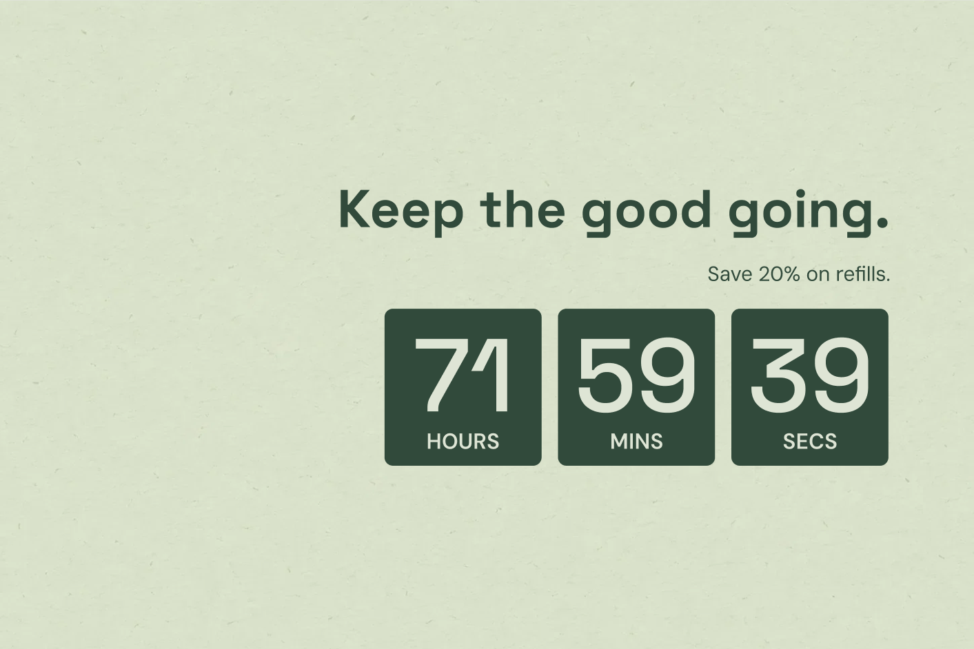

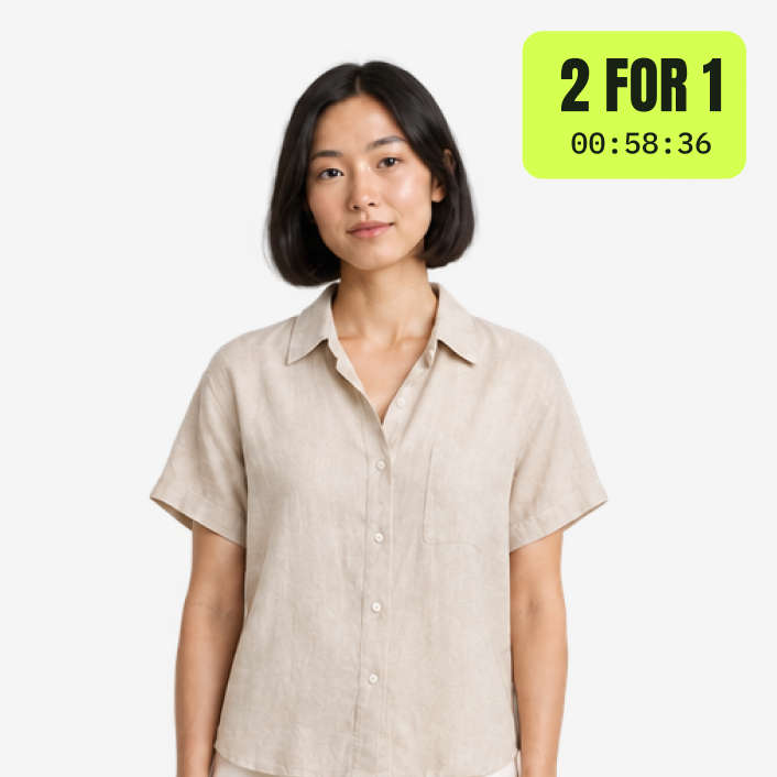
Do not imply that a page timer has recognised a customer’s account or calculated their personal credit balance. Audience selection belongs in the email, customer or loyalty system. The countdown can carry the message on the destination page, with the timing and eligibility configured in the appropriate system.
A restrained Small or Inline presentation can work well because the relationship is already established. The product story and benefit may deserve more space than the clock. A bright preset is still an option for a playful brand, but the copy should sound like a continuation of the relationship rather than another anonymous acquisition offer.
The business opportunity is relevance. A familiar customer may appreciate a timely invitation more than a larger generic discount. Measure whether the campaign brings meaningful repeat purchases, and avoid giving customers a reason to wait for an incentive every time they need to reorder.
The deadline should help an already useful message land. It should not be the entire reason the store has contacted them.
Give future spending a present benefit
“Gift cards: 10% extra” is another way to frame value. Someone who already knows the store may welcome an opportunity to buy a gift card with a defined bonus during a short campaign. It can serve a gift purchaser or a customer planning a future purchase, without reducing the shelf price of every product today.
Make the bonus, redemption terms and campaign deadline clear, and configure the actual gift-card offer separately. Treat the economics carefully: money received now is accompanied by a future redemption obligation. The timer can make the purchasing window visible, but the proposition has to remain attractive and workable after the campaign has ended.
An invitation to be there
Some campaigns sell participation before they sell a product. A live demonstration, a creator session or an early-access window gives customers a reason to show up at a particular time. The countdown helps make that time memorable.
A Large design can anchor the event announcement on your homepage: what people will see, when it starts and where to go. “See the new collection styled live” offers a clearer benefit than “Join our event.” The clock creates anticipation, while the description explains why the appointment is worth keeping.
Turn a live event into an appointment
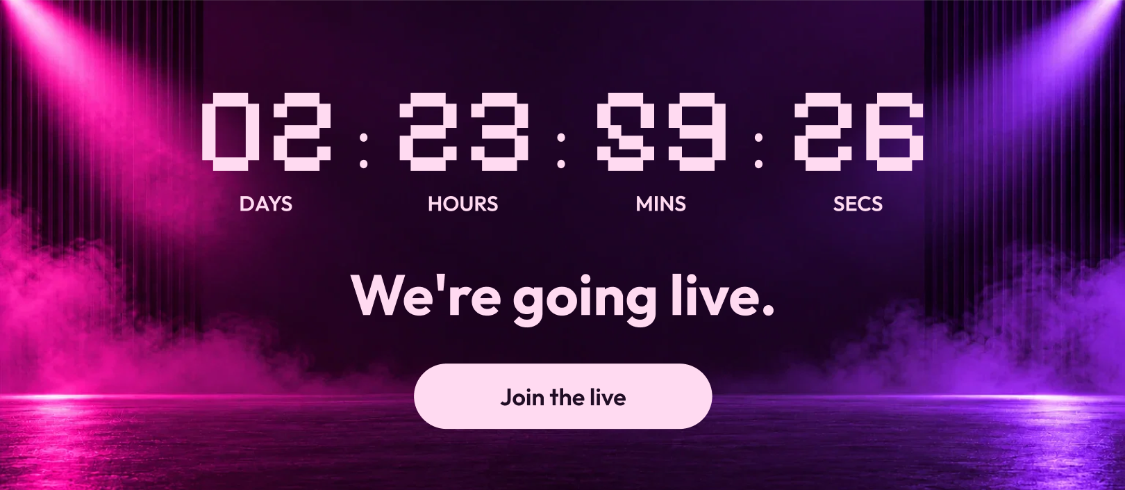
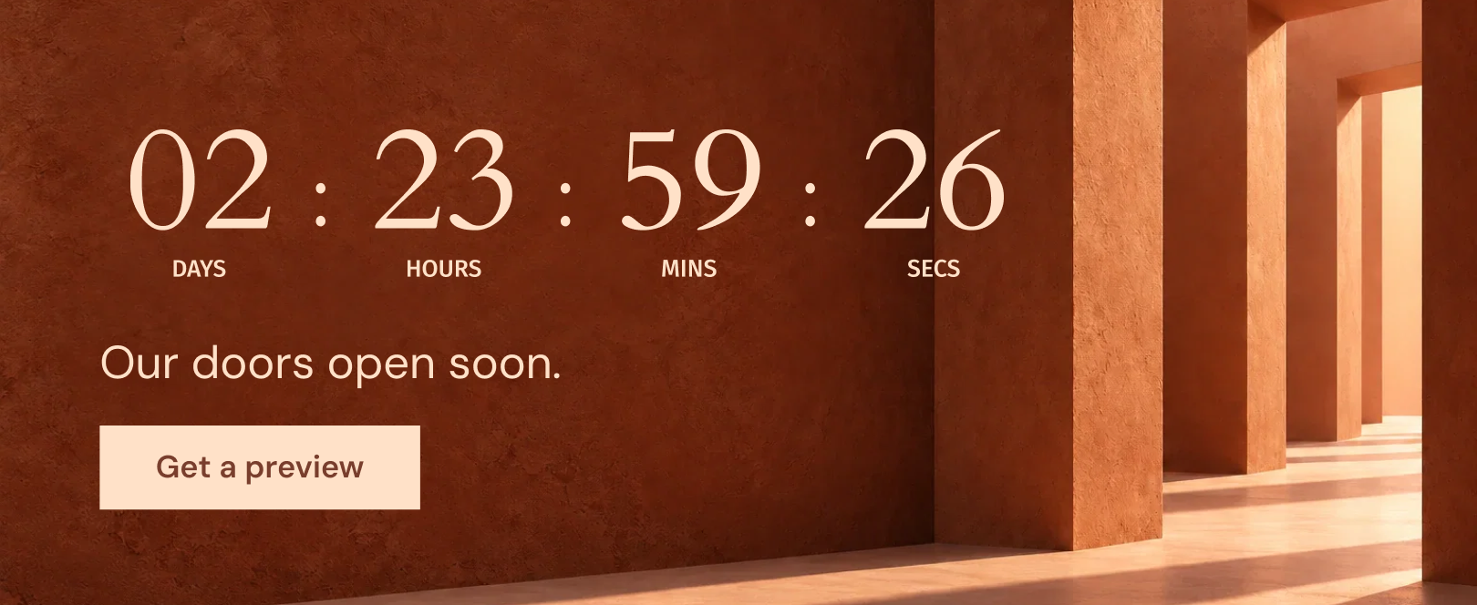
A homepage Inline bar can introduce the event to visitors who arrived for another reason. A storewide Bar can carry a final reminder as the start approaches. These placements have different jobs: one explains the event in context, the other keeps the time within sight.
Early access needs equally clear wording. Is the timer counting toward the opening of access, or toward the end of an exclusive window? “Members shop first until 6 pm” and “Early access opens at 6 pm” describe opposite situations. The design should not make customers infer which one applies.
Use a shared fixed date for a common event. If registration is required, the button can lead to the relevant destination. Make the invitation as easy to accept as it is to notice.
Prepare the next state before the event begins. A waiting page should become an event destination. Afterwards, a recording or collection page may extend the value of the attention you gathered. An expired timer is a poor ending to an otherwise good invitation.
Make early booking or a shared purpose the reason
An event can also have an early-booking price. “Tasting tickets: save $10” pairs a concrete experience with a closing window. The customer can picture what they are buying: a place at the tasting, not an abstract opportunity to save. Link directly to the booking destination and keep the early price aligned with its real deadline. If places are limited too, show that information separately from the clock.
A community campaign can create a different motivation. A preset such as “We double your donation” suggests a shared objective rather than a personal saving. For a store running a genuine matched-donation campaign, the deadline can make participation feel like part of a moment people are contributing to together. Explain the beneficiary, match terms and any cap clearly on the destination page.
A compact Inline can sit beside the ticket price or donation action, while a Large section gives the event its main introduction. Neither invitation needs aggressive copy: the experience or shared purpose gives people a reason to act, and the timer explains when their action matters.
An opening, a booking, a shared cause


A rhythm customers recognise
A repeating promotion can become part of a store’s routine: an afternoon special, a Friday edit or a scheduled window for a particular service. The attraction is familiarity. Customers understand when the opportunity appears and what makes it worth returning for.
Daily mode can run within selected hours and on selected weekdays. That makes it appropriate for a genuine recurring window. A compact Bar can announce the opening, or an Inline bar can sit above the relevant products while the offer is active.
Today's offer, tomorrow's price
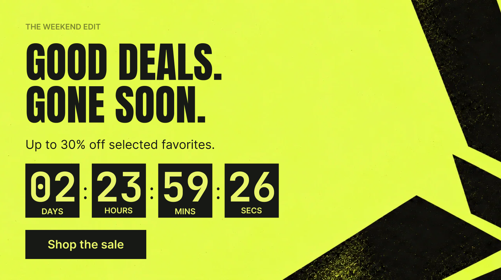

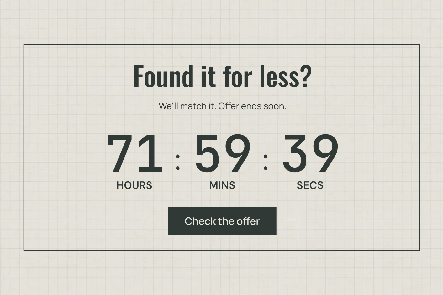


The creative task is to make recurrence feel intentional. “The Friday extra: a gift with qualifying orders until 5 pm” sounds like a recognisable event. A clock that repeatedly announces “final chance” teaches a different lesson: the stated deadline may not mean very much.
Consider the operational and commercial rhythm together. A recurring offer might support a quieter part of the week, align with a pickup schedule or focus attention on a regularly changing selection. Keep the incentive sustainable enough that repeating it does not erode the value of your normal prices.
The app also offers repeat behaviour for other timing models, including fixed-date hour windows and evergreen restarts. The setting is useful only when it matches the underlying promise. Decide how the offer repeats first, then choose the clock that describes it accurately.
Recognition can be an asset. A consistent colour, a familiar location and a clear recurring name can make the timer part of the experience customers expect, while the products or benefit give them a fresh reason to care.
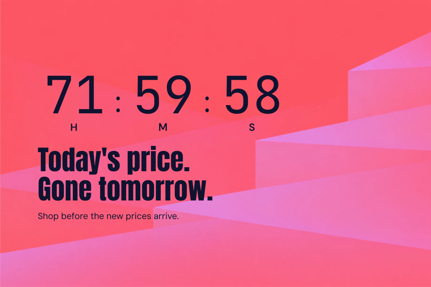
A changing price can give that rhythm another shape. “Price drops in…” builds anticipation before the next offer; “Prices rise in…” explains the end of a defined introductory price. The clock can point toward either transition, but the store must implement the price change. Make the direction unmistakable: a customer waiting for a lower price and one deciding before an increase need different information.
Where to put a countdown timer on Shopify
The cases above use the same six formats in different ways. That is the point: a format is a place in the journey, not a campaign strategy by itself.
The Bar is the travelling reminder. It can be static or sticky, at the top or bottom, carrying a concise message as people move through the store. It suits a deadline that matters across several pages, provided it does not crowd the navigation or other persistent controls.
The Inline bar belongs to a section. It introduces a collection, separates a campaign from surrounding content or keeps a cart offer close to the summary. Because it remains in the page flow, it can be expressive without following the shopper everywhere.
Small gives an offer a compact home. It has room for explanation and an action beside a product or within a suitable cart layout. Inline is the quieter relative: a tight presentation for a deadline that should read naturally alongside existing information.
The Product label brings the timing to the item. It helps people recognise participating products in a grid or on a product page. Large gives the campaign a stage, with enough room for imagery, atmosphere and a fuller proposition on a homepage or password page.
Different placements for a launch

Choose the minimum set that helps the journey. A hero, reminder bar and product label can work together when each answers a different question. Repeating the same large message in every available location can make the campaign feel harder to escape rather than easier to shop.
Let the design express the kind of urgency
There is no single countdown aesthetic. A sale clock can be loud. A dispatch clock can be almost invisible until someone needs it. A launch clock can look like part of the art direction. That range is why presets are useful: they give you a composition to adapt instead of leaving every campaign to begin with four plain boxes.
The same clock, a different feeling
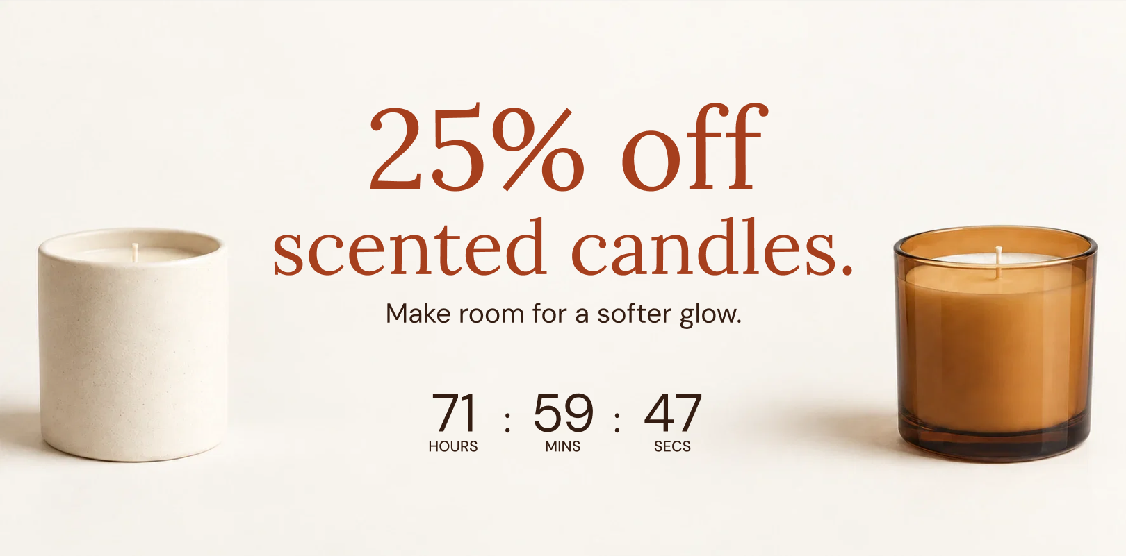
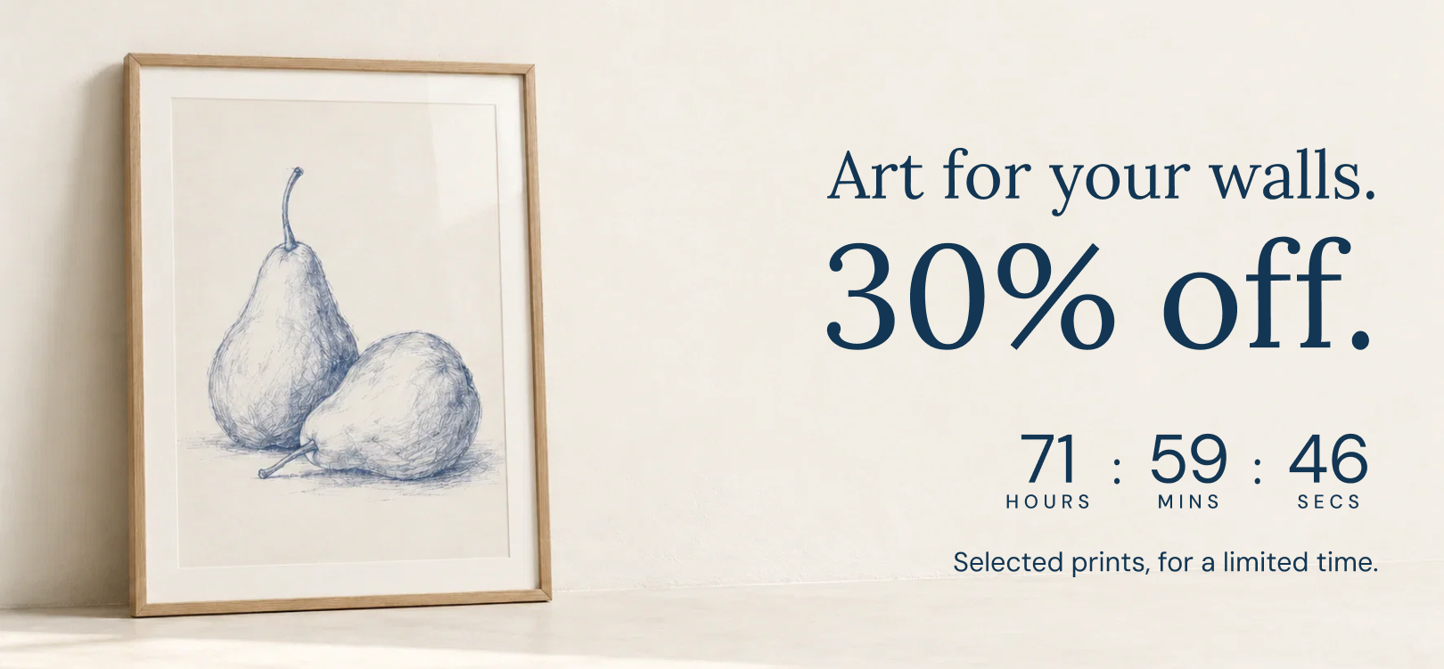
Bright can be confident
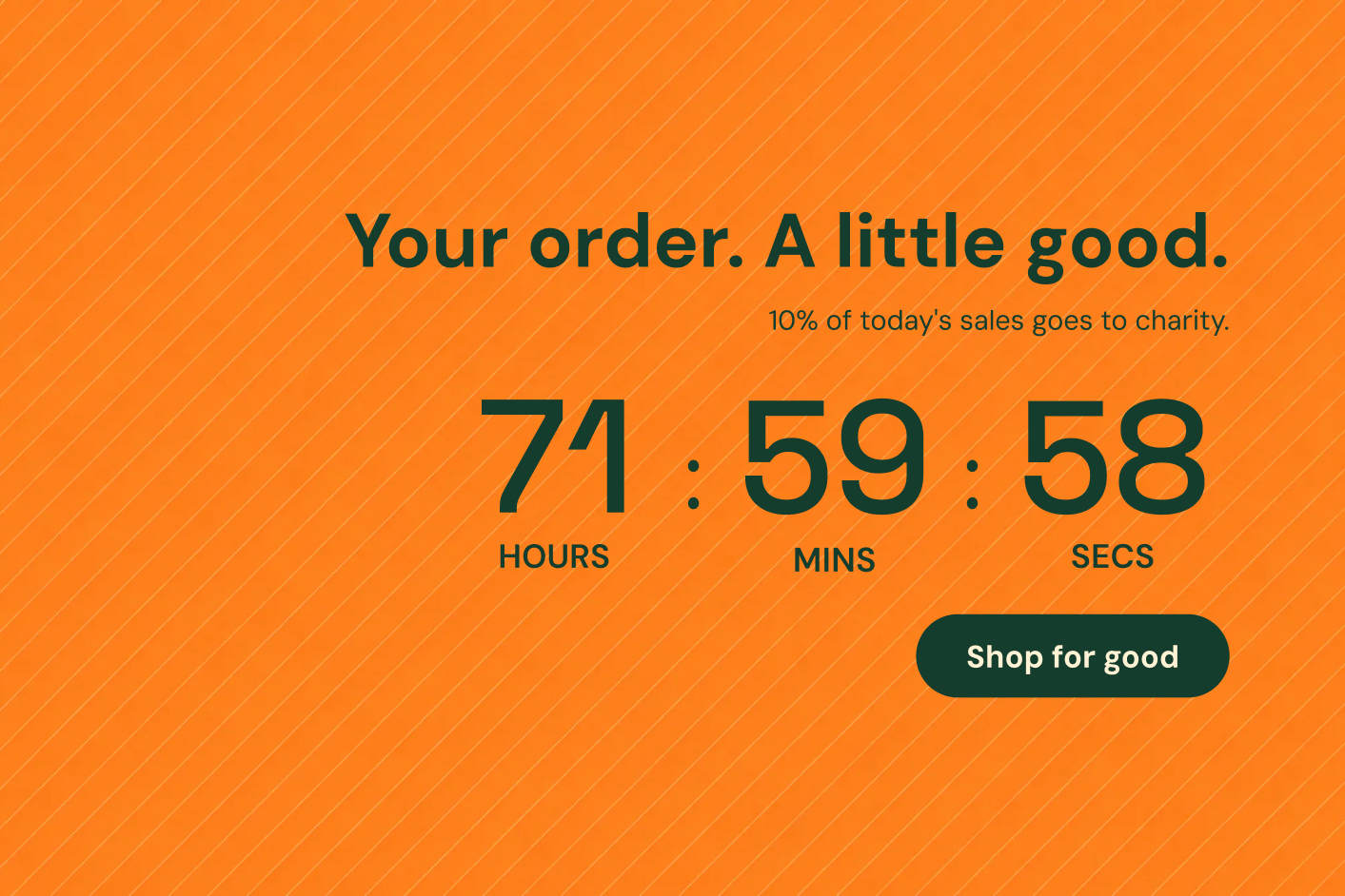
High-contrast colours, oversized type and strong geometric shapes can make a brief promotion feel energetic. They work best when the offer is simple enough to read quickly. A bold background should give the message a stage, not make the conditions difficult to find.
Black Friday does not have to be black. A saturated gradient or unexpected colour can distinguish the campaign within your own storefront. Keep the button visually separate, and carry enough of the brand’s typography or imagery into the design that it still feels like your store.
Small does not mean plain
Quiet can be persuasive
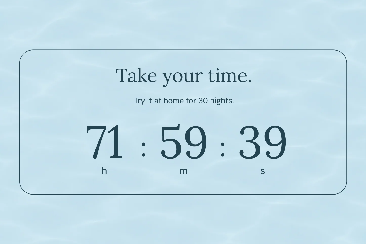
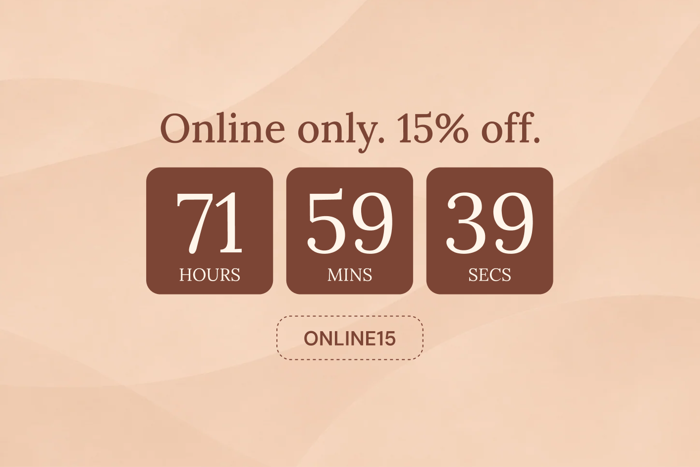
A shipping cutoff or preorder deadline often needs clarity more than spectacle. A text-like timer with careful spacing can sit beside product information without looking like an interruption. The confidence comes from precision: the right promise, at the right moment, in language the shopper can understand.
Minimal design still requires decisions. Make the digits large enough, choose labels people can read and avoid low contrast. A small timer that demands effort to interpret has lost its main advantage.
A product label can whisper or shout
Motion should have a purpose
Changing digits already provide movement. Product labels can add entrance effects such as slide, fade or scale, and repeating effects such as beat, shake, bounce or swing. These can make a playful promotion feel alive, especially when the rest of the page is relatively still.
Judge motion in the real layout. One bouncing label is a different experience from a grid full of them. An effect should help the shopper notice the campaign and return to the product, rather than keep pulling attention away from the decision.
Choose time units with the same care. Days fit a launch next week. An hours–minutes–seconds display fits a daily cutoff. Minutes and seconds can suit a short sale. Milliseconds create a much more intense rhythm; use them only when that pace belongs to the campaign, not simply because the option exists.
Make the preset your own
The editor provides controls for text, fonts, colours, backgrounds, borders, corners and spacing, with available components and settings depending on the format. The timer can use different digit layouts, labels and separators. A button, coupon or icon can support the message where needed.
Begin by removing anything the campaign does not need. Then adjust the hierarchy: offer first, remaining time second, useful action next. Translate the words and unit labels for the relevant storefront languages, and read the result at its actual size. A translated line that fits on desktop may become awkward on a phone.
How to add a countdown timer to Shopify
Start with the campaign, then choose the placement. Install GSC Countdown Timer Bar from the Shopify App Store, create a widget and choose a preset for the format you need. Set the deadline, edit the message and connect the button or coupon to the offer. A sale across the store might need a sticky countdown bar; a product-specific offer may belong beside the purchase controls instead.
Use the app’s placement controls to add the widget to your theme. For an embedded timer, open the relevant template in Shopify’s theme editor, position the app block and save. The available positions depend on the theme. Preview the actual storefront on desktop and mobile, and follow the campaign all the way from the timer to checkout.
Build the offer behind the clock
The best-looking timer still needs a working campaign beneath it. The discount, product availability, delivery promise or event destination is what the customer ultimately experiences. The widget makes that opportunity visible.
For coupon campaigns, create the discount in Shopify and paste its code into the coupon component. The coupon action copies the code and uses Shopify’s discount route to apply it for checkout; Shopify determines whether the order meets its conditions. Keep the discount’s timing aligned with the clock and test both a qualifying and a non-qualifying cart.
For a launch, prepare the destination that becomes relevant at zero. For shipping, match the message to fulfilment. For a gift, configure how it is awarded. These connections are where a campaign becomes dependable, and they deserve as much attention as the preset.
Fixed-date, evergreen or daily countdown timers?
Choose the clock according to the promise. Fixed date is a common deadline in the store’s timezone. Daily is a recurring timetable. Evergreen is a visitor-based duration remembered in that browser. Daily follows its selected hours and weekdays. With Fixed date and Evergreen, choose the appropriate end behaviour: hide, leave visible or repeat where the mode supports it. A repeat should describe a genuinely recurring opportunity.
Targeting helps keep the message relevant. Page rules can focus a bar on the right areas of the store, while product rules can connect labels to eligible items. A promotional page is not automatically a customer segment, and a product condition is not automatically a cart condition. Keep the campaign’s audience and eligibility logic in the systems that actually control them.
Give mobile its own attention
A desktop preview is generous. A phone reveals the real compromises: the header, the cookie notice, a sticky purchase button, a product photograph and a countdown all trying to share a small screen.
Use the available mobile font, width and spacing controls deliberately. A sticky bar should remain readable without swallowing the opening view. A Product label should not cover the detail someone needs to judge the item. A cart message should leave the total and checkout action easy to reach.
Check the longest realistic content, not only the neat sample. A long product title, a translated offer or a coupon label can change the layout. Look at more than one product image, because a label that sits beautifully on an empty corner of one photograph may cover the subject of another.
Embedded placement also depends on the theme. Small and Inline formats can suit cart drawers, but the actual position must be supported by the theme’s app blocks or integration. Preview the store people will use, with its navigation and purchase controls present, before calling the campaign ready.
Measure what the deadline changed
A timer can attract attention without improving the business. A discounted order can raise revenue while reducing contribution. A customer may buy during a campaign even if they would have bought the same product tomorrow at full price. These are reasons to measure the whole offer, not reasons to avoid experimenting.
Choose the outcome that fits the case. A clearance campaign is about the promoted stock and the economics of moving it. A gift threshold is about worthwhile order value after the reward cost. A launch is about the audience you gather and the purchases that follow. A dispatch reminder is about eligible orders arriving before the cutoff.
Use available app statistics with Shopify results, and compare periods or audiences that are meaningfully similar. Treat clicks, views and coupon interactions as parts of the journey. They help explain engagement, but they do not establish that the countdown caused additional profit.
Keep experiments interpretable. Try a different placement with the same offer, or a brighter preset with the same deadline and destination. If you change the discount, audience, message and design together, you may find a successful campaign without learning which decision made it successful.
The worthwhile outcome is not a more nervous shopper. It is a customer who understands the opportunity, sees why the timing matters and has an easy way to act. That is how a clock becomes part of a good shopping experience.
Where the money can come from
A countdown campaign can change several different parts of the business. It can help an interested visitor place a first order, make a useful second item feel worth adding, bring a familiar customer back, or turn slow stock into room for the next collection. Those are distinct jobs. “More sales” is too vague a brief to choose between them.
Consider a deliberately simple illustration. An $80 order has $45 in variable costs, leaving $35 before fixed overhead. A useful add-on takes the order to $105; its extra cost is $8 and the campaign gift costs $4. The resulting contribution is $48. That is $13 more from the order if the campaign actually causes the add-on purchase. These are invented example numbers, not app results, but they show why a relevant extra can be more interesting than a storewide discount.
Discounting has a different equation. With a $100 order and $50 variable cost, contribution is $50. Taking 20% off leaves $30. At unchanged costs and product mix, you would need about 67% more orders to reach the same contribution. A countdown can make a discount more visible; it cannot make that arithmetic disappear.
The creative opportunity is to give the shopper something they genuinely value at a cost the store can support. A gift with a high perceived value, a well-chosen upgrade, an extra item from the right category or an earlier delivery can all change the offer. The clock turns that particular version of the offer into an occasion.
Questions about Shopify countdown timers
Can I add a countdown timer to a Shopify product page?
Yes. In GSC Countdown Timer Bar, Small and Inline formats can sit alongside product information where the theme supports app blocks. Product labels can show a deadline on product images, including cards in a collection. Choose the placement that keeps the offer close to the buying decision without covering important product details.
Is there a free Shopify countdown timer app?
GSC Countdown Timer Bar has a free plan with one active widget, all widget types and unlimited views. It includes recurring and daily timers. Paid plans add capacity and targeting options; check the current plans on the Shopify App Store for the limits that apply to your campaign.
How do I choose a Shopify countdown timer app?
Begin with where the deadline needs to appear and how it should behave. A storewide sale needs a shared end time; a daily dispatch message needs a repeating schedule; a welcome offer may need a visitor-based window. Then compare placement options, mobile design, coupon actions, targeting and what happens at zero. Preview your actual campaign in the theme before deciding that a preset is the right fit.
Should every promotion have a countdown?
Only when time changes the opportunity. A genuine sale close, launch, dispatch cutoff or ordering window gives the clock something useful to communicate. A permanent offer may be better served by clear copy and a strong destination.
Can the same campaign use several formats?
Yes. A Large section can introduce it, a Bar can keep the deadline visible, and Product labels can identify qualifying items. Give each placement a distinct job and keep their offers and end times consistent.
Does an evergreen countdown identify a returning customer?
It remembers its end time in the same browser. That helps preserve the window across ordinary reloads, but it is not cross-device customer identification or a substitute for enforcing personal discount eligibility.
Which timer is right for a repeating shipping cutoff?
Daily mode fits an active window on selected weekdays in the store’s timezone. Keep the message aligned with the actual shipping service and update the schedule when operating hours change.
Can the timer create a discount, gift or stock reservation?
The timer communicates the offer and can provide a coupon or destination. Create the discount and configure gift or inventory behaviour in the appropriate store setup. A countdown reaching zero does not itself reserve a cart, award a gift or change a product’s availability.
How do I know whether the design is too much?
View it in the full shopping journey, especially on a phone. If the product, price, conditions and next action remain easy to understand, the design is doing its job. If shoppers must work around the timer to browse or buy, reduce its size, motion or repetition.
Where should I start?
Choose one real campaign and one place where its deadline will help. Start from a preset that fits the mood, complete the offer and destination, and test what happens when time runs out. The most compelling timer is the one attached to an opportunity your customers already have a reason to want.